Some new things to look at
Haven’t posted in a while, and progress has slowed down again in the last couple of weeks due to several reasons, making me miss DEMO DAY 16. But I still have some new things to show. I have been working on big graphical changes for the game. As you know this game started as small Jam game so a lot of stuff was done in a rush and I was never totally happy with it, so now I’m taking my time on it to get better looking and more polished results.

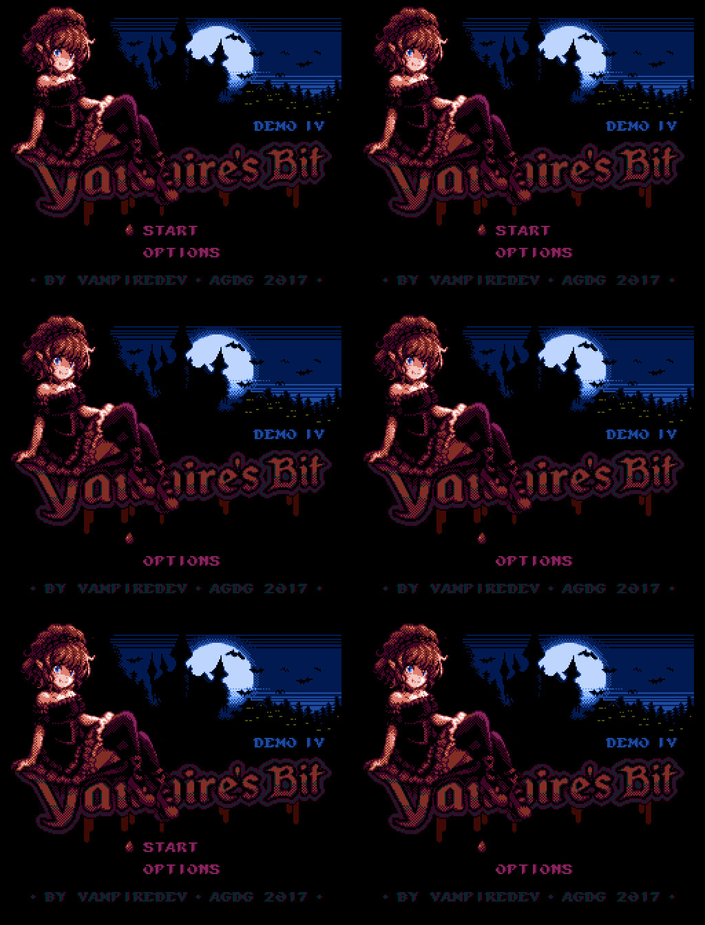
New Title screen. A lot of people loved the old one, but I always thought I could do better, so I kept the main idea but remade the graphics to improve them as much as much I could. Elzie now looks more closer to her current design rather than her early sketches, and the background is less plain and boring. Better planing also allowed me to use the palette more efficiently, getting more colors in play for both her dress and the night sky. You can also see the new font here, hopefully more readable than the older one.

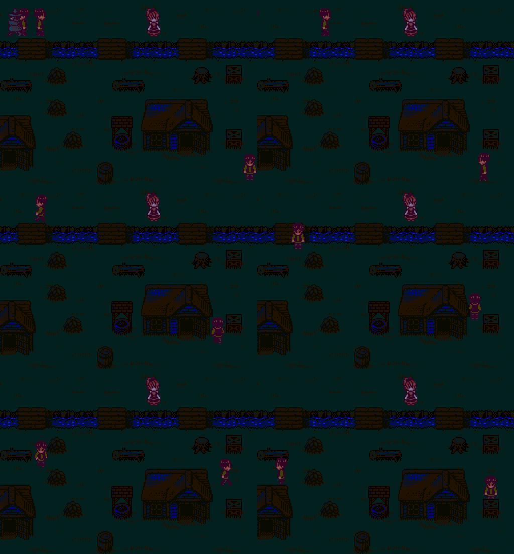
The river finally stopped being just a scrolling layer and now it has its own animation. Houses and obstacles now have some blue on their palettes and are a little bit smaller, making the scene look less cramped and the free paths easier to see. I want to have more different obstacles, and different themed stages so there is still a lot of work to do here.

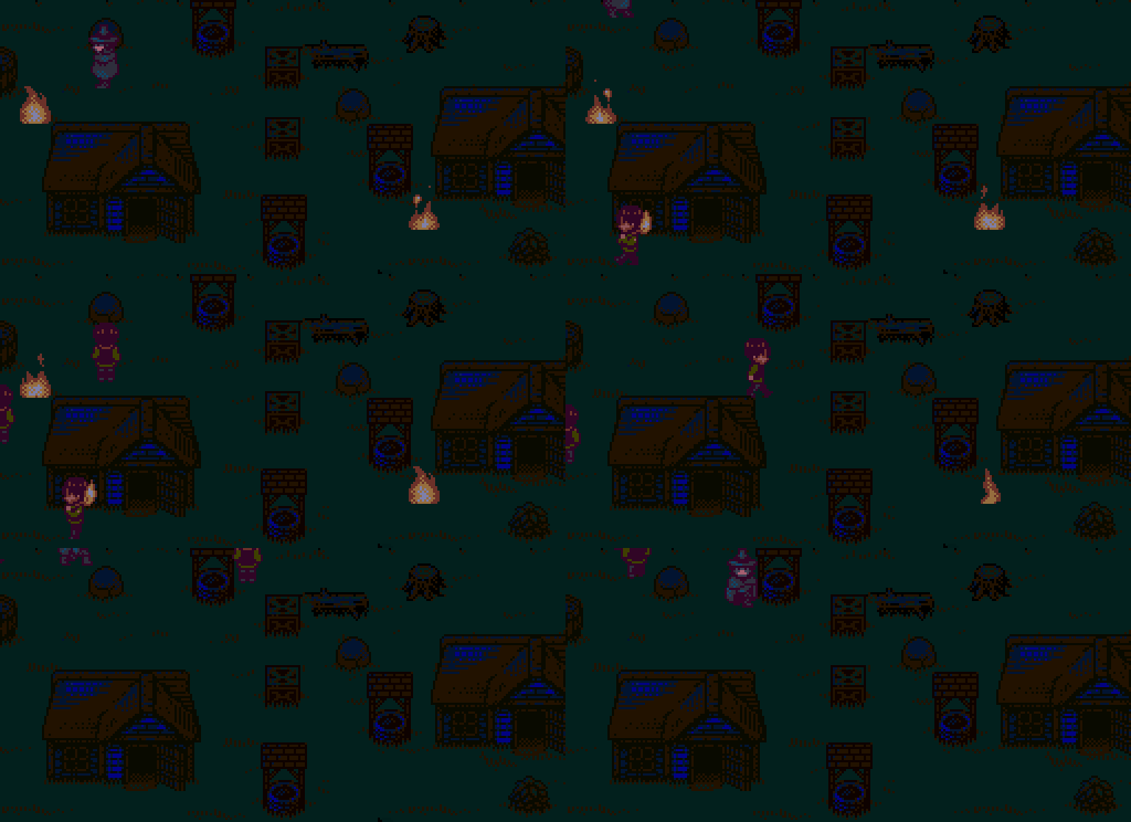
Fire placeholders were replaced with their final animation too. I'm still testing different things for how the player will deal with fire.

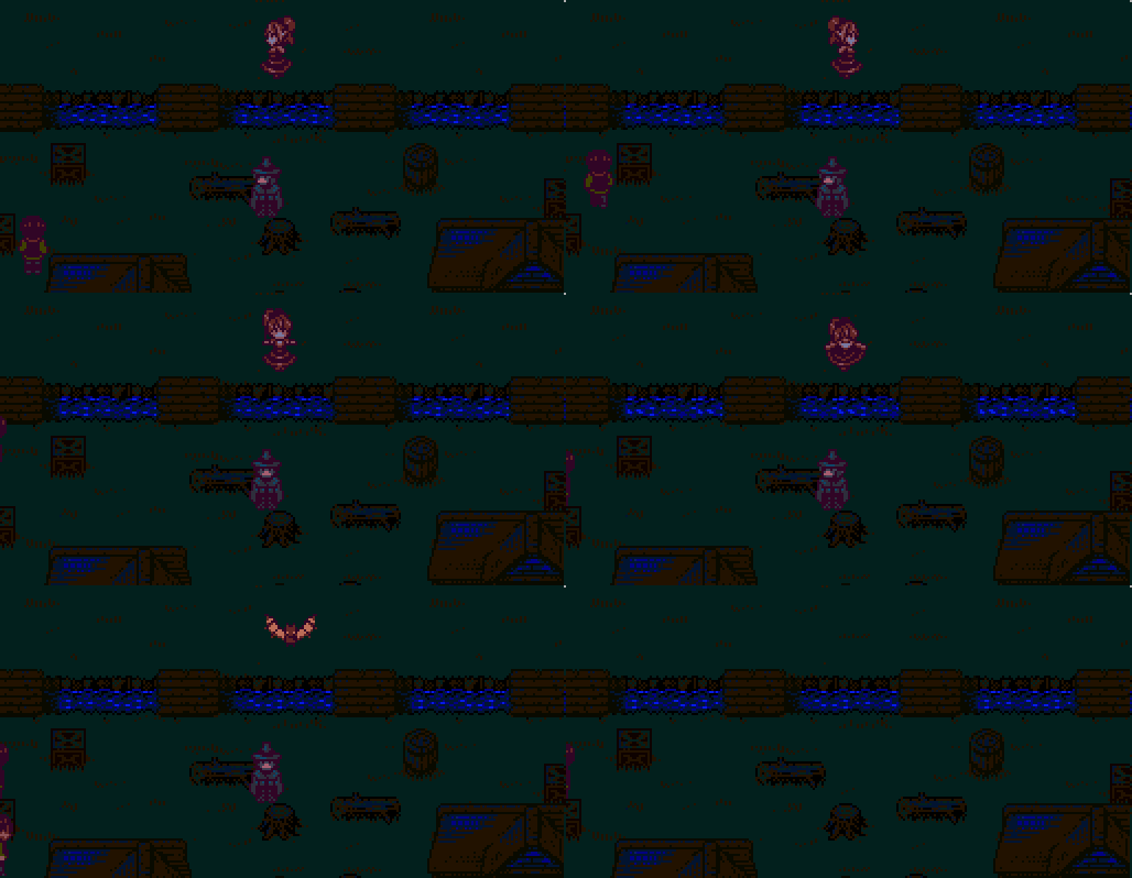
And besides of replacing old and ugly placeholders, I'm also adding some new animations too. Here's a small test for a cute Stage Clear animation.
As you can see there is a lot of new stuff in the works, and that means a lot of things to draw and a lot of things to code.
I'll do my best to make the wait worth it!
Get Vampire's Bit [DEMO 4]
Vampire's Bit [DEMO 4]
Help this cute vampire to get something to drink!
| Status | In development |
| Author | VampireDev |
| Tags | 2D, 8-Bit, Anime, Arcade, Female Protagonist, High Score, Pixel Art, Retro, Singleplayer, Vampire |
| Languages | English |
More posts
- A little bit of StoryNov 30, 2021
- Vampire's Bit [DEMO 4] is out!Oct 31, 2019
- Devlog Start!Jul 30, 2017
![Vampire's Bit [DEMO 4]](https://img.itch.zone/aW1nLzI2MzkyNTcucG5n/original/z%2BOi%2Fz.png)
Leave a comment
Log in with itch.io to leave a comment.